If you’ve worked in test automation or software engineering for any duration, you’ll be familiar with some common problems: managing test data, reliable test environments, maintaining stubs/mocks, robust and lightweight automated test suites, pushing tests “down” the pyramid and accurately measuring test automation/related quality metrics of applications under test.
In this article of the “Quality Assured” series I’ll be discussing the latter. More specifically, how we utilise Grafana dashboards to create a singular view of the quality of our applications across multiple key metrics by aggregating data from numerous software/code quality tools. This enables us to easily track trends on important metrics like unit test coverage, number of production incidents, pull request health, security scan critical issues and automated test suite execution times, frequency and pass/fail rates.
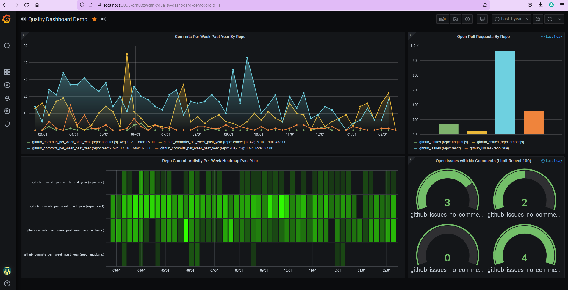
For the more technically inclined, there’ll also be a short tutorial demonstrating how to set up the dashboard below locally (which uses the Github API for data on some popular JavaScript UI libraries) in under 10 commands and 15 minutes!
Why are dashboards important?
Firstly, why would we want to do this? Well, as Peter Drucker once said: “if you can’t measure it, you can’t improve it”. If we want to improve quality, we need to define what high quality software looks like and create processes to measure and visualise it (ideally automatically) so we can ensure it’s improving.
Fortunately, most software tool creators agree - with many of them having sophisticated dashboard functionality. The problem, however, is that these tools or dashboards aren’t interoperable, have differing capabilities (e.g. alerts, charting) and user interfaces that need to be individually learned. The solution? To automatically and regularly extract the underlying data in these tools and move it to a single dashboard tool, cue Grafana, InfluxDB and Jenkins.
Introducing Grafana & InfluxDB
Grafana is a multi-platform, open-source, analytics and interactive dashboard web application. It provides charts, graphs, and alerts functionality and supports connections to a variety of data sources including time-series databases like Prometheus, Graphite and InfluxDB, logging databases like Loki and Elasticsearch, SQL databases like MySQL, PostgresSQL and MS SQL and cloud services like CloudWatch and Azure Monitor.
Given our focus on monitoring trends on quality metrics over time, we opted to use the time-series database InfluxDB. The next step was to identify:
- The quality metrics we wanted to capture (e.g. unit test coverage)
- How the data from the related tool (e.g. SonarQube) could be extracted (e.g. SonarQube REST API, web scrape, DB access)
- How the extracted data could be published to InfluxDB (e.g. InfluxDB REST API)
- A process for doing this automatically (e.g. a Jenkins job and some JavaScript running daily)
- The best way to visualize the data in Grafana (e.g. a dashboard with various charts)
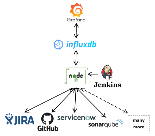
For simplicity and to minimise security risks, we opted to use authenticated REST APIs to extract the relevant data with a subsequent request to the InfluxDB REST API to publish the data. A diagram of this set up is shown below.
A quality dashboard in under 15 minutes
Now we have an understanding of how the data flows to our Grafana dashboards, let’s set up a simple version locally. For this example you’ll need to have Git, Docker Desktop and NodeJS installed. We’ll deploy a Grafana, InfluxDB & Chronograf stack, create a database, set up a dashboard and execute a script to pull data from github and publish it to InfluxDB.
From your cmd terminal, enter the following commands to download an excellent docker image containing Grafana, InfluxDB & Chronograf and run them locally in a detached state.
1 | docker run -d --name docker-influxdb-grafana -p 3003:3003 -p 3004:8083 -p 8086:8086 -v influxdb:/var/lib/influxdb -v grafana:/var/lib/grafana philhawthorne/docker-influxdb-grafana:latest |
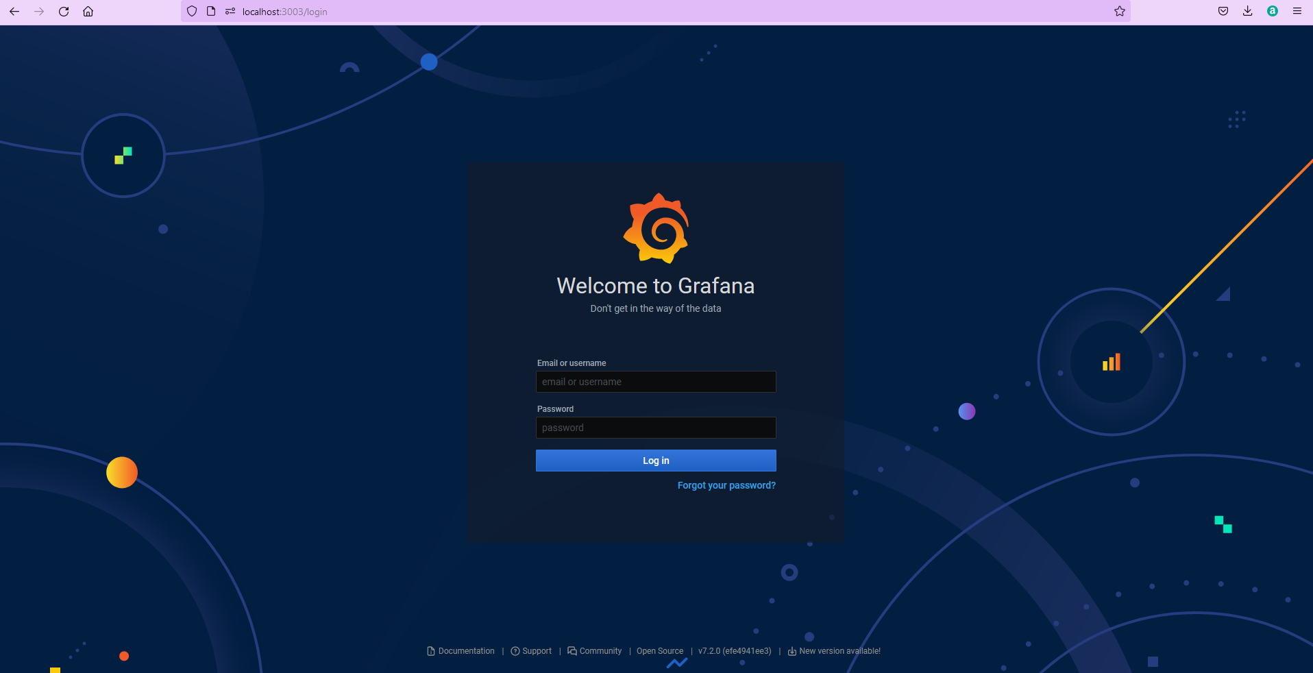
Once complete, you should be able to access your local Grafana by visiting http://localhost:3003, where you’ll be presented with a log in screen as shown below.
Before we set up our Grafana dashboard, we need to create a time-series database in InfluxDB for our data. For this, we have a few options – use the InfluxDB CLI (requires ssh’ing onto the docker container), use the InfluxDB REST API or use Chronograf, a web application that provides various features for managing InfluxDB and related tools like Kapacitor, including an InfluxDB admin interface. I’ve listed steps for the last two below, be sure to follow just one of the approaches.
To create a new InfluxDB via the REST API, simply perform the following (assumes cURL installed – for Windows users this is available via Cygwin or Git Bash):
1 | curl -XPOST 'http://localhost:8086/query' --data-urlencode 'q=CREATE DATABASE "test"' |
Alternatively you could send the same request from a tool such as Postman.
To create the InfluxDB via Chronograf, visit http://localhost:8086 in the browser and follow the steps below.
- Welcome page: click Get started
- InfluxDB Connection: leave the defaults and click Add Connection
- Dashboards: click Skip
- Kapacitor Connection: click Skip
- Setup Complete: click View All Connections
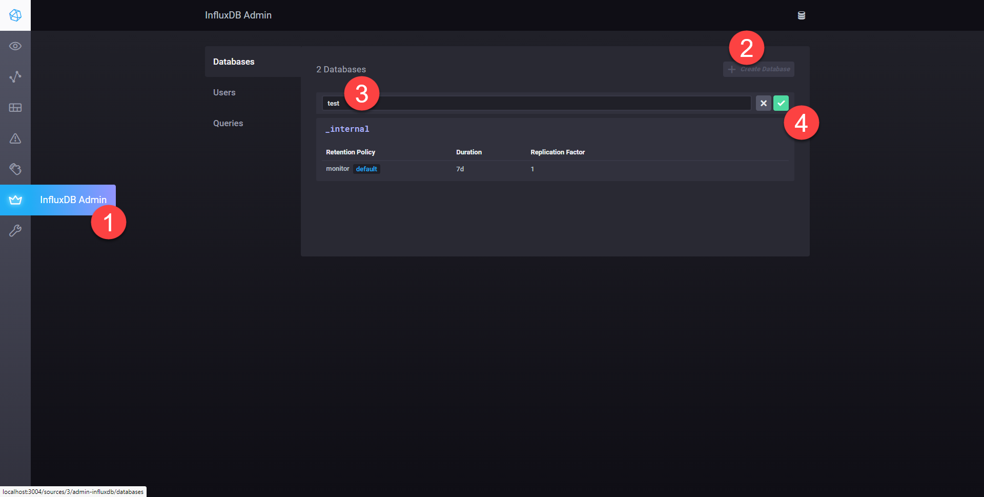
From the Chronograf home page, click InfluxDB Admin from the left hand navigation, select “+ Create Database” from the top right, enter test in the input field and lastly click the green tick to create it, as shown below.
Now our database has been created, let’s switch back to Grafana (http://localhost:3003) and log in.
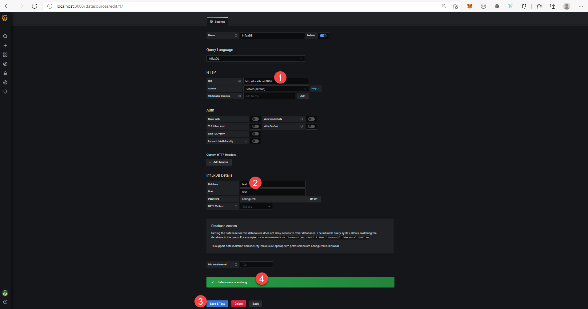
The default user is root and the password is also root. Next, you’ll need to create a new Data Source connection. Select the “Add your first data source” banner from the home page or Configuration > Data Sources from the left hand navigation followed by “Add data source”. From the list of supported data sources, click InfluxDB and enter the details shown below. Then select Connect & Test and select Back.
HTTP
InfluxDB Details
- Database: test
- Leave the default settings for User and Password (root / root)
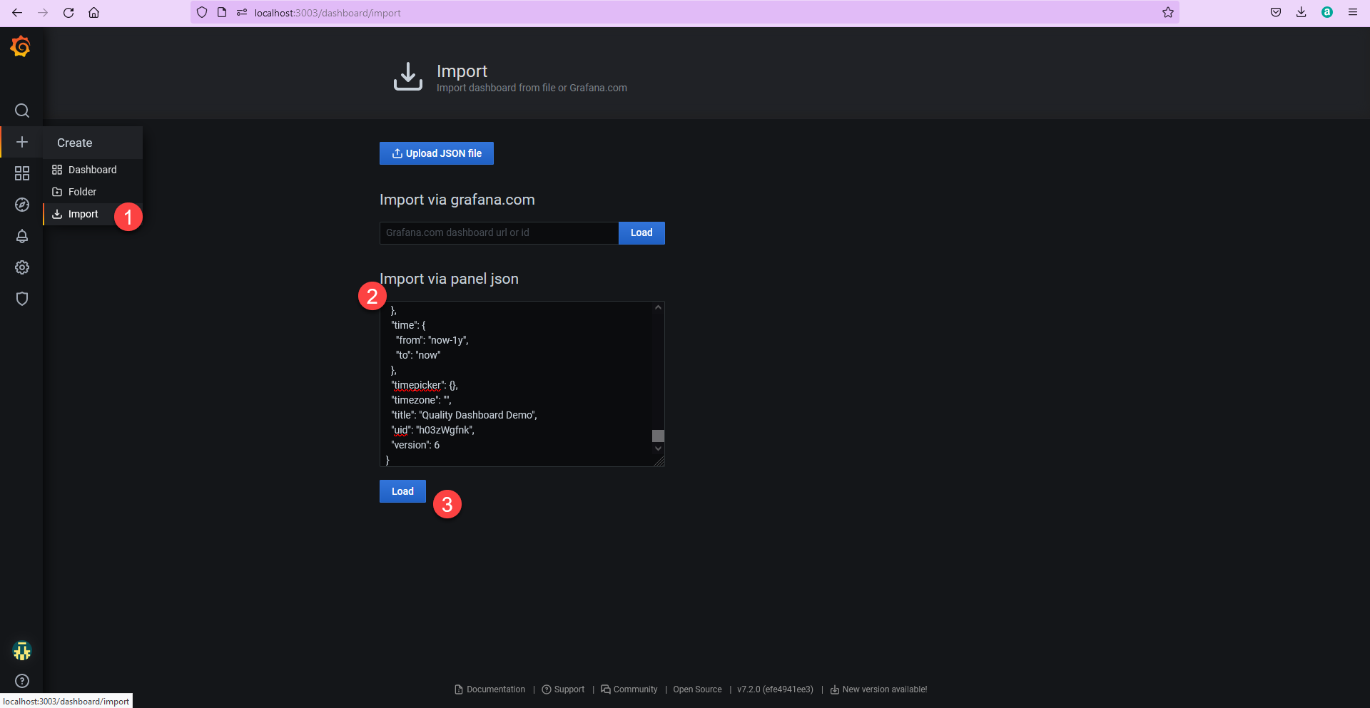
Let’s create a new Dashboard by importing a template I’ve created with a number of charts/queries already set up. From the left hand navigation, select Create > Import and copy the JSON from this gist and select Done, as shown in the screenshot below.
The final step is to run a script I’ve created to pull data from Github and publish it to the InfluxDB database our charts are set up to use. You’ll need to clone the example repository containing the script, install some dependencies and run it. Do this by performing the following commands:
1 | git clone https://github.com/philqa/quality-dashboard-demo |
Now return to Grafana (http://localhost:3003) and our dashboard panels should have auto-updated to look like the screenshot below:

In reality, we deploy this image to OpenShift and have our data scripts running overnight from Jenkins, but this exercise should give you a taste of the power and simplicity of Grafana, InfluxDB and data aggregation via REST APIs. There’s plenty of other features Grafana provides too, such as Alerts/Notification Channels and a rich Plugin landscape, hopefully I can cover these in a future article.
I’d love to know which metrics you visualize, how and why, so please feel free to reach out.
